Red & Pink Art
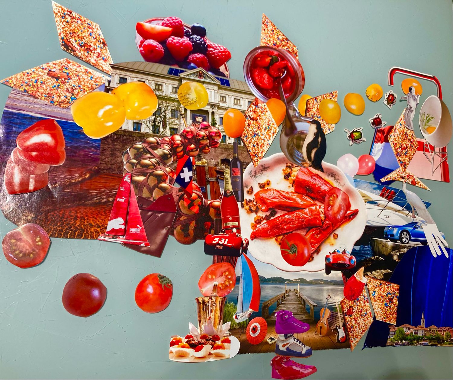
| Explore red and pink art created to bring warmth, emotion and immediate visual impact to an interior. The palette ranges from bright red and burgundy to hot pink, blush and coral. Some compositions feel romantic and playful, while others are graphic, powerful and celebratory. Hearts, diamonds, stars, food imagery and abstract forms give these colours very different personalities across the collection.
Bastiaan van Leeuwen builds many SAPARTISANÉ ART compositions through layered paper, geometric structures and carefully balanced contrasts. Red may be paired with gold, white or black for strength, while pink often meets blue, yellow or purple for a brighter contemporary effect. Because colour is judged by the overall visual impression, each product has one primary category and only the most relevant secondary placement. Red and pink artwork can energise neutral rooms, echo textiles and flowers, or create a striking contrast against blue and green furnishings. A vivid piece works well as the room’s focal point; softer pinks can introduce colour without overwhelming the space. The selection includes wall art and a small number of art-led home accessories. For a more personal result, the studio can discuss a custom collage based on your preferred red or pink palette, meaningful photograph, pet, portrait or story. For an easy interior link, repeat a small red or pink detail in a cushion, vase or flower arrangement rather than matching everything. Warm reds sit naturally with wood, cream and gold; cooler pinks feel fresh with grey, navy and white. View the complete product page before purchase for the exact format, materials, availability and installation details, especially where an original mixed-media work or accessory differs from the wall-art collection. |

-50%
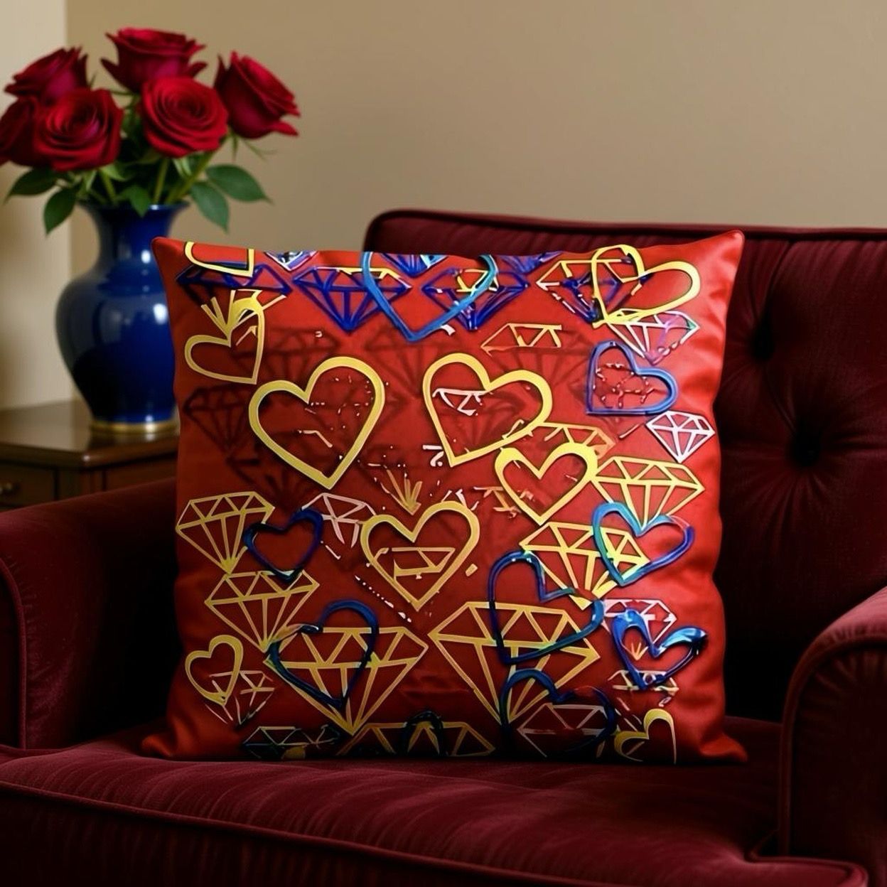
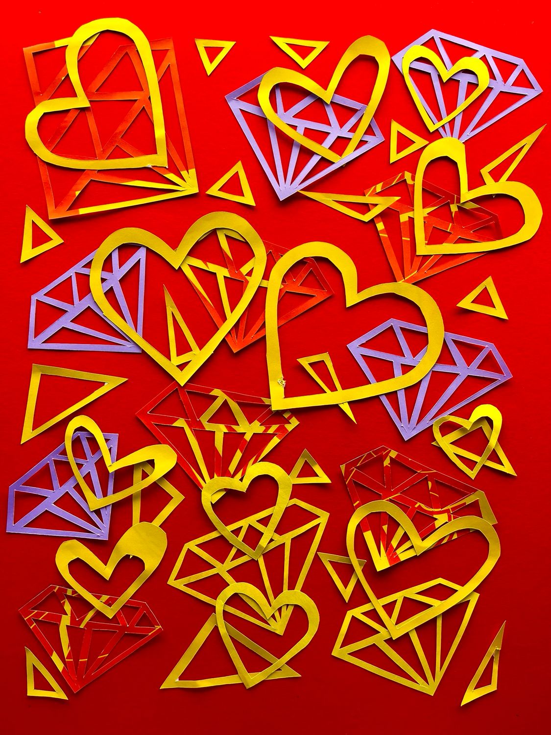
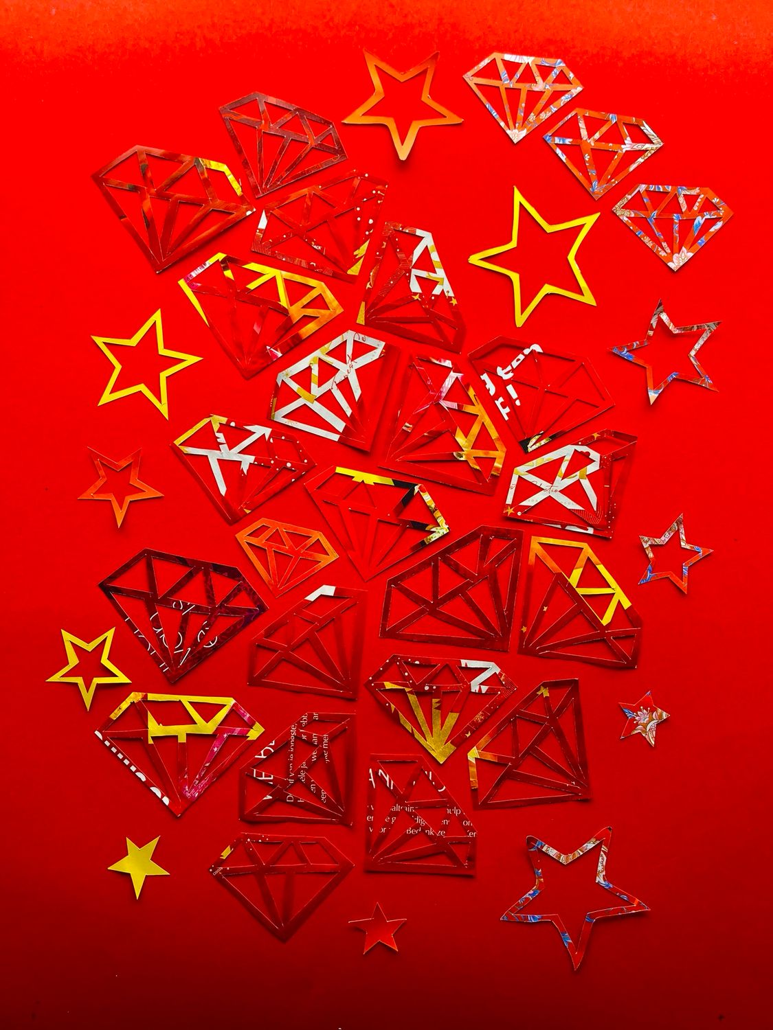
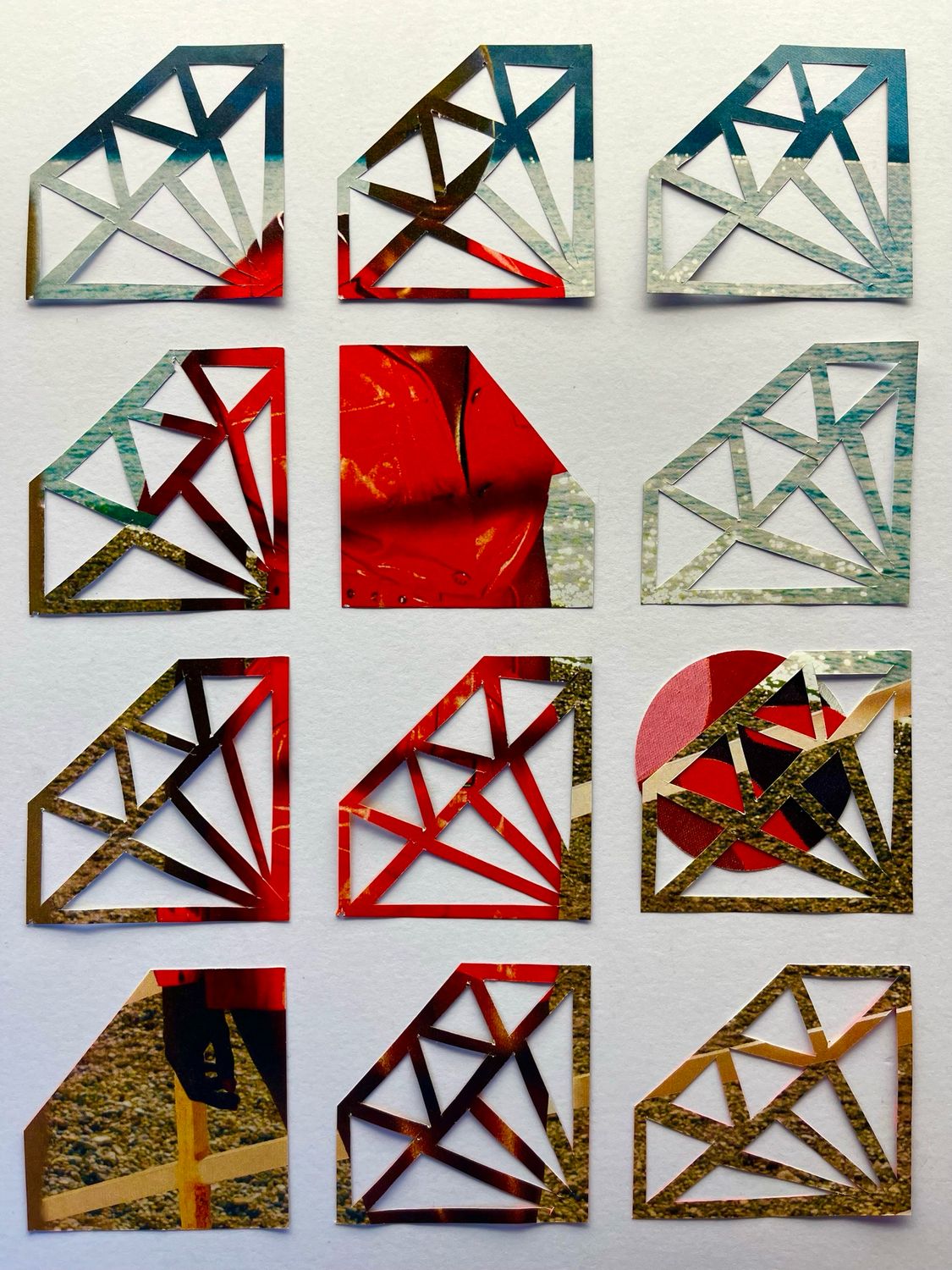
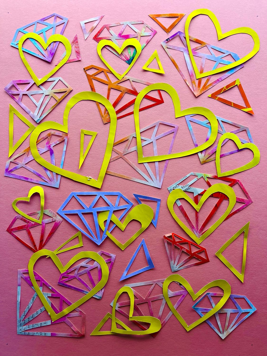
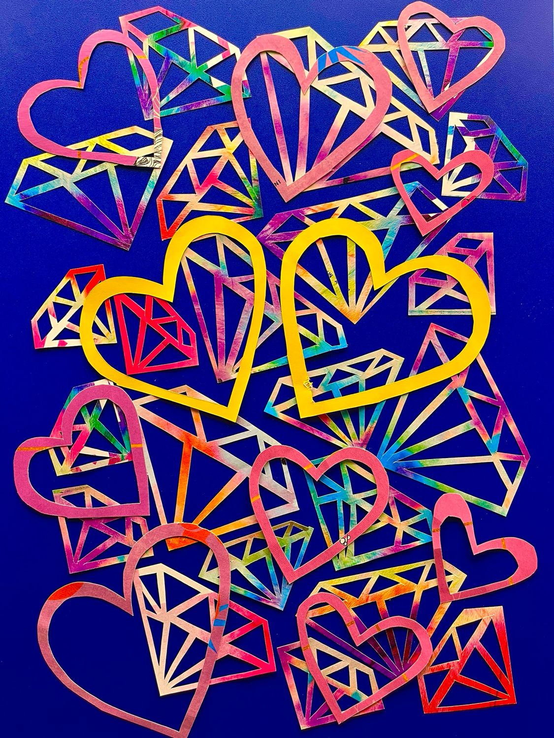
Diamonds & Hearts Art Pillow Red– 40 x 40 cm
Diamonds & Hearts Art Pillow Red– 40 x 40 cm
Free shipping
was €178.00
Save 50%
€89.00

-50%
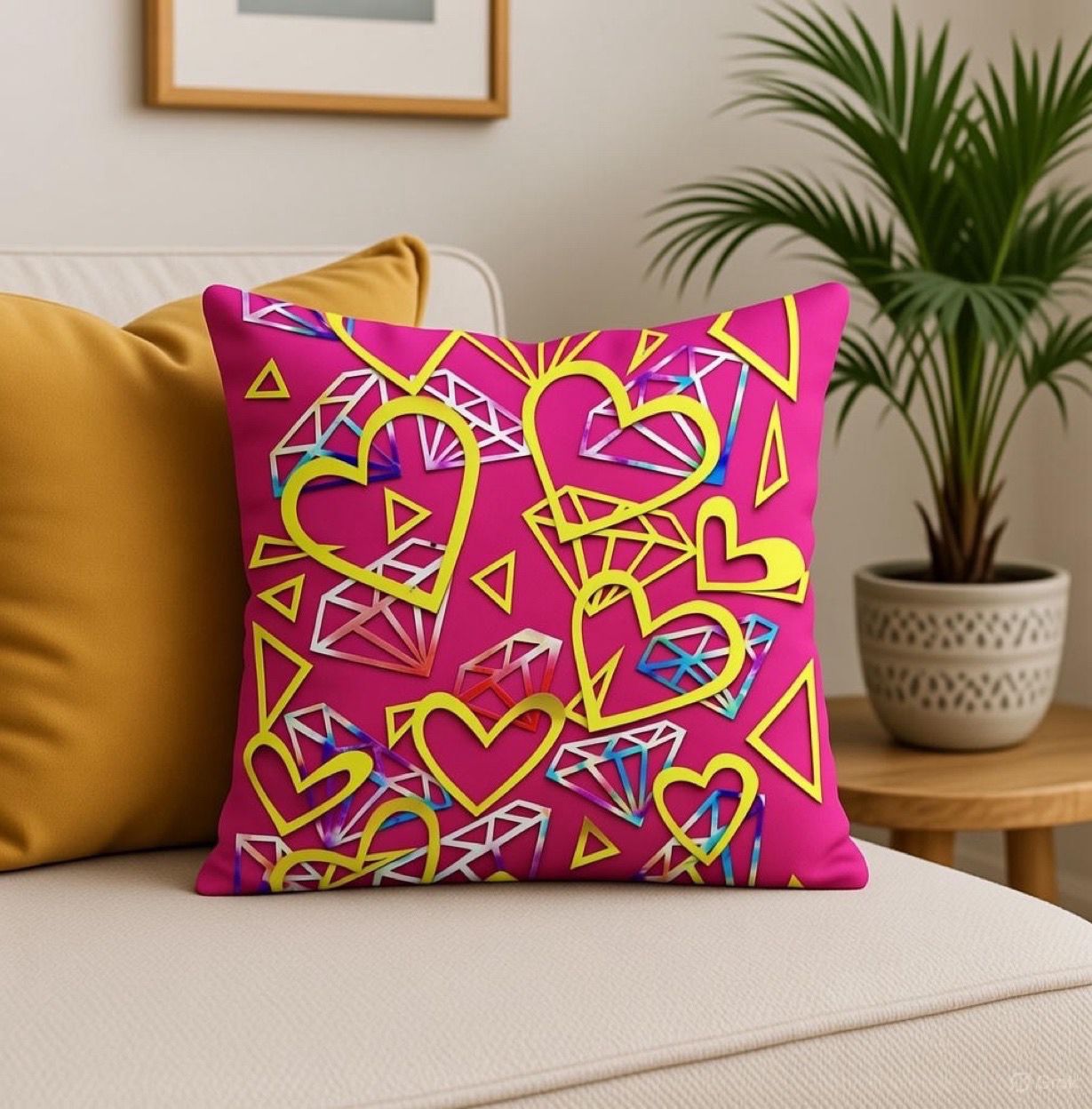
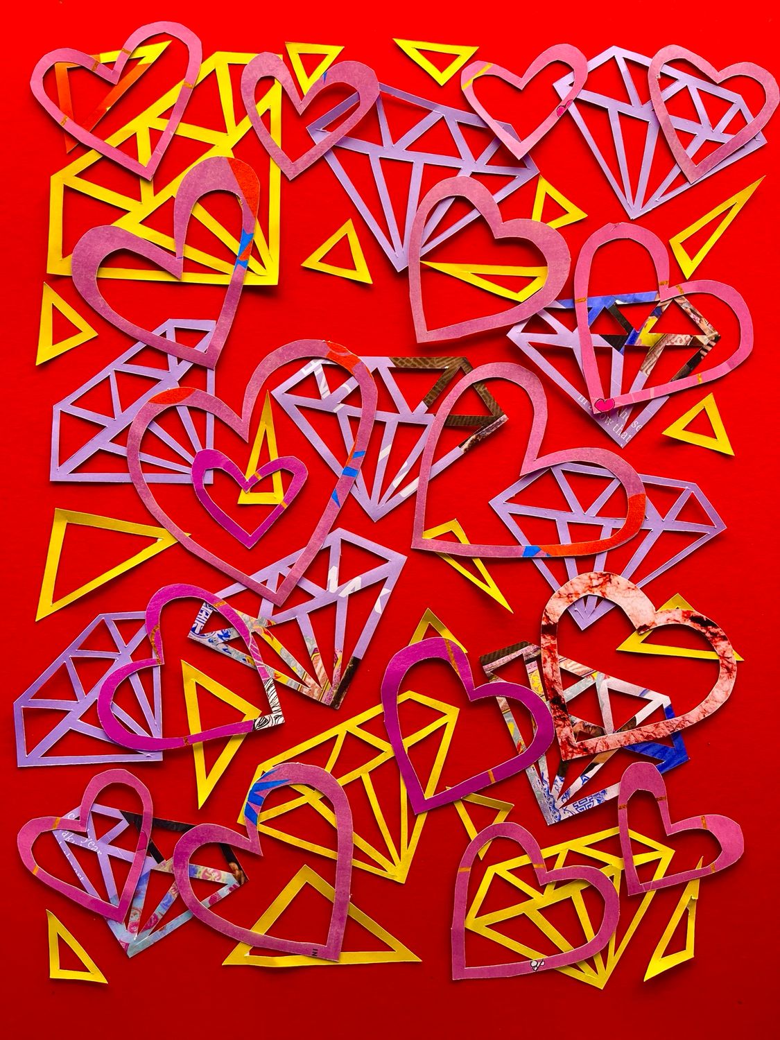
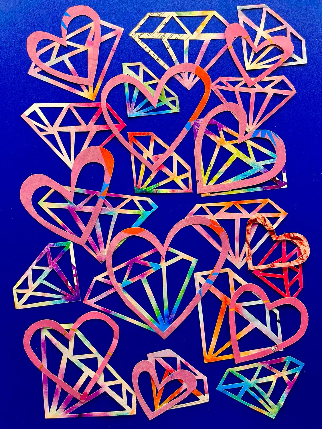
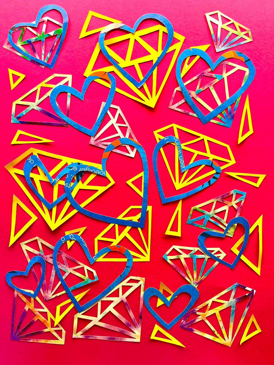
Diamonds & Hearts Art Pillow Pink – 40 x 40 cm
Diamonds & Hearts Art Pillow Pink – 40 x 40 cm
Free shipping
was €178.00
Save 50%
€89.00
Display prices in:EUR